The Great Paint Debate: Why Your Scale Model’s Colours Are Probably Wrong (And Why That’s Perfectly Fine)
When is green not green and why scale matters. A simple guide to colour perception for modellers.
Bill "The Major" Major · · 3 min read
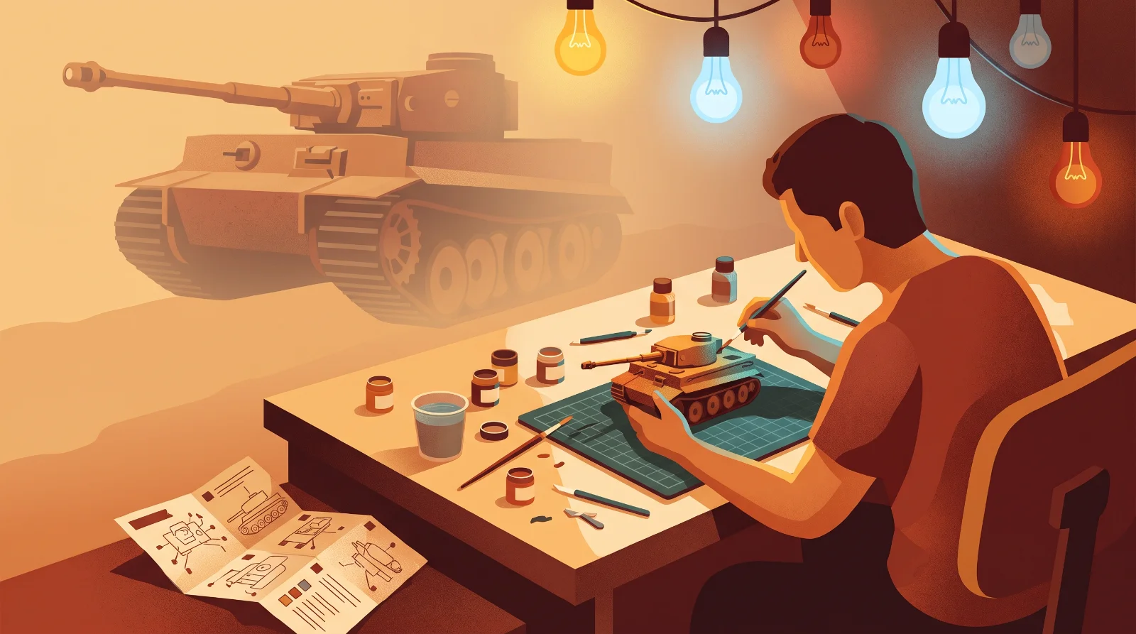
If you’ve spent any time in the scale modelling community, you’ve likely stumbled into a forum debate about the exact, scientifically perfect shade of US Olive Drab or Luftwaffe RLM 74. Voices get raised, citations from obscure 1943 supply manuals are thrown around, and friendships are tested over a 2% variance in yellow tint.
But here is the absolute, unvarnished truth: getting the colour "perfectly right" is mostly a myth. The science of human colour perception, combined with the physical realities of scale, means that your paint job will always be a beautifully educated guess. Let's break down why you should trust your own eyes and stop sweating the exact match.
The Scale Effect (Or Why 1:1 Paint Looks Wrong at 1/72)
Imagine standing next to a real Avro Lancaster or Sherman tank. Now imagine looking at that same vehicle from a few hundred yards away. The atmosphere between you and the object scatters the light, causing the colours to appear lighter, slightly desaturated, and shifted toward the blue-grey spectrum. This optical phenomenon is known as atmospheric perspective.
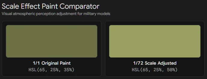
When we build a 1/72 or 1/48 scale model, we are artificially simulating viewing that object from a distance. If you take a tin of paint perfectly matched to the 1:1 factory original and spray it onto a tiny piece of plastic, it will look far too dark and intense to the human eye. To make a model look correct, we have to add "atmospheric distance" by introducing white or light grey to the base colour. The smaller the scale, the more you need to lighten it.
Let There Be Light (But Which One?)
Have you ever painted an armoured vehicle late at night under the cool, harsh glare of your LED workbench lamp, only to take it into the living room the next morning and realise it looks completely different? Welcome to metamerism.
Colours only exist because of the light bouncing off them. The exact same painted plastic will look vastly different under the fluorescent lights of a competition hall, the warm incandescent bulbs of your home, and natural sunlight. Since you cannot control where your model will be viewed, chasing an objective "true" colour is a fool's errand. Build and paint for the lighting environment where the model will actually be displayed.
The Reference Trap: A House of Cards
We all use reference photos, but they come with severe health warnings for the rivet-counters among us:
Colourised Photos: Never base a paint scheme on a colourised historical image. No matter how skilled the digital artist is, they are making subjective guesses based on greyscale values. A dark grey tone in a 1944 photo could be dark green, dark blue, or mud. It is artistic interpretation, not historical evidence.
Other People’s Models: Using someone else's model as your primary colour reference is like playing a game of visual Telephone. You are inheriting their scale effect adjustments, their lighting biases, and their mistakes.
Museum Restorations: This is the big one. While top-tier aviation and military museums are getting better, many historical restorations were painted by enthusiastic volunteers in the 1970s and 80s using whatever commercial tractor or automotive paint was closest to the original spec at the local hardware shop. Just because it is sitting in a museum today does not mean it left the factory looking like that in 1942.
Kit Callouts: A Polite Suggestion
When the kit instructions tell you to mix three drops of XF-62 with one drop of XF-4, they aren't handing down stone tablets from the modelling gods. Kit colour callouts are a close guesstimate designed to get you in the ballpark using the paint ranges the manufacturer happens to have a commercial relationship with. They are a starting point, not a legal requirement.
The Verdict: Trust Your Eyes
When you factor in the scale effect, weathering, sun fading, wartime supply chain inconsistencies, field-applied camouflage, and the lighting in your own display cabinet, the concept of a single "correct" colour completely falls apart.
Do your own research, look at primary sources where possible, but ultimately, reach your own conclusions. If the Panzer Grey looks right to you under your shelf lights, then it is right. Paint the model that makes you happy, and let the purists argue in the forums while you're busy enjoying the hobby.
Keep exploring
Overcoming the wall
Overcoming the wall, hitting a block, losing your mojo. All terms modellers use to describe the point during a kit build when you just can't take any more!
Modelling with ADHD, OCD and a Busy Brain
Honest pitfalls and practical bench strategies for modellers living with ADHD, OCD, anxiety and more.
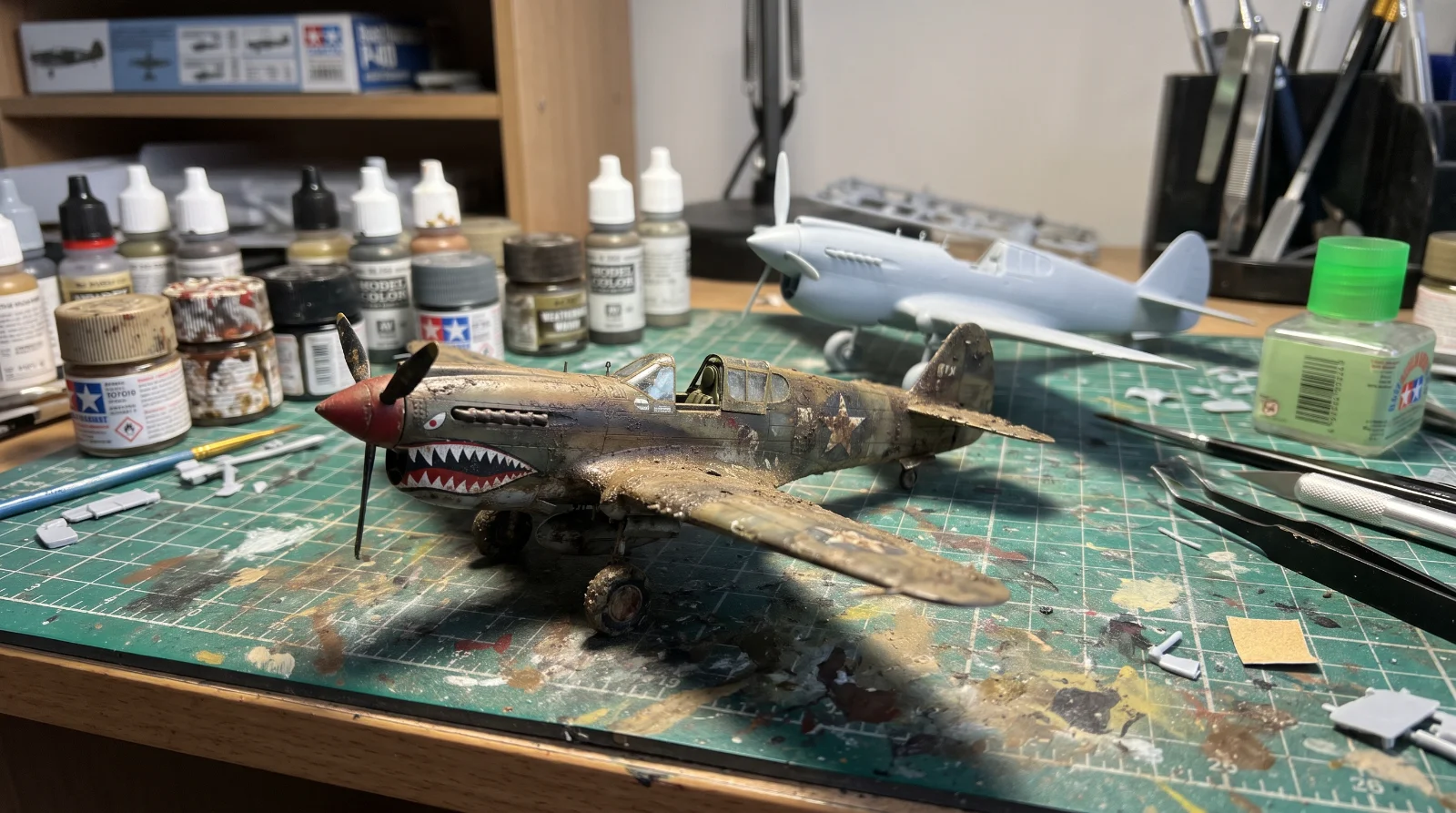
Weathering - how much is enough?
Weathering - the skill of making a model aircraft look used & weatherbeaten. Is it really necessary?